Gazelle Coffee Roasters
Contribution: Creative Direction & Design

The Ask
A local woman-owned coffee roaster company was looking for a visual identity to represent their product and overall brand experience. The owners and their friends are active in both the physical and social sense, which was an important factor to consider as we thought about the look and feel of the brand. Inspired by Gazelles and the beauty, grace, and playfulness they represent, the identity needed to communicate a sense of energy and beauty that would still appeal to their male customers.

The Logo
Taking a less traditional approach to the logo, the “icon” portion exists as a set that represent the core themes of the brand. They are designed to be used collectively in a variety of ways as well as on their own. Each icon represents something unique to the theme of the brand. The coffee ring represents the free spirited nature the brand inspires, the overlapping routes show that every run can be a new adventure. The flowing beans speak to the handmade process, and the six-pointed star is a nod to roots of the brand being created in a suburb of Chicago.


Creating a Pattern
Using the iconography artwork and introducing additional elements, I was able to create an evolving and adaptable pattern that can be used in many different instances.

Packaging
For the initial launch of the brand, we explored ways of hero’ing the flexible brand pattern system as an all-over print as well as testing the simplicity of pulling individual, relevant elements from the pattern for a cleaner, more minimal look. This was an exploration of seeing how the brand can be turned up or down, depending on the audience and application.


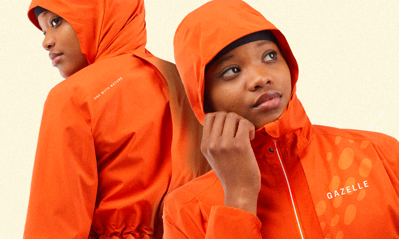
Apparel
The Gazelle Coffee Roasters brand is “steeped” in it’s love for being active outside and building community around that. Apparel created for the brand is primarily designed for indoor and/or outdoor activity.


