Frontier
Contribution: Naming, Art Direction & Design

The Ask
Develop a brand for mobile app experience focused on building a community and connecting like-minded individuals whose interests fall under the categories of finance and investing. The brand is affiliated with an event that facilitates similar connections in an an intimate, outdoor setting. It is important that Frontier establishes a connection the outdoors to help tie the two together.
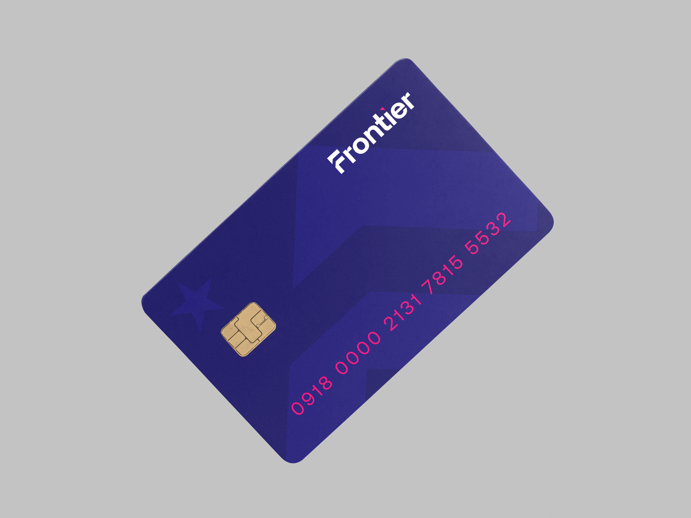
When turned 90 degrees to the right, the “F” in the type version of the logo converts to an icon that is representative of two mountains. The star is the sky is an additional nod to the outdoors and can also be found in the logo of Frontier’s parent brand. Finally, the two mountain shapes also act as upward point arrows, which was pulled from inspiration the client shared during the discovery process.
Monogram
