Personal Wedding Branding
Contribution: Creative Direction & Design

The Logos
I had the privilege of designing the look and feel of all of the collateral for my wedding. I chose to treat this like a traditional design project, involving my future wife as the client for the project. My style leans a little more experimental and my wife’s is a bit more traditional.
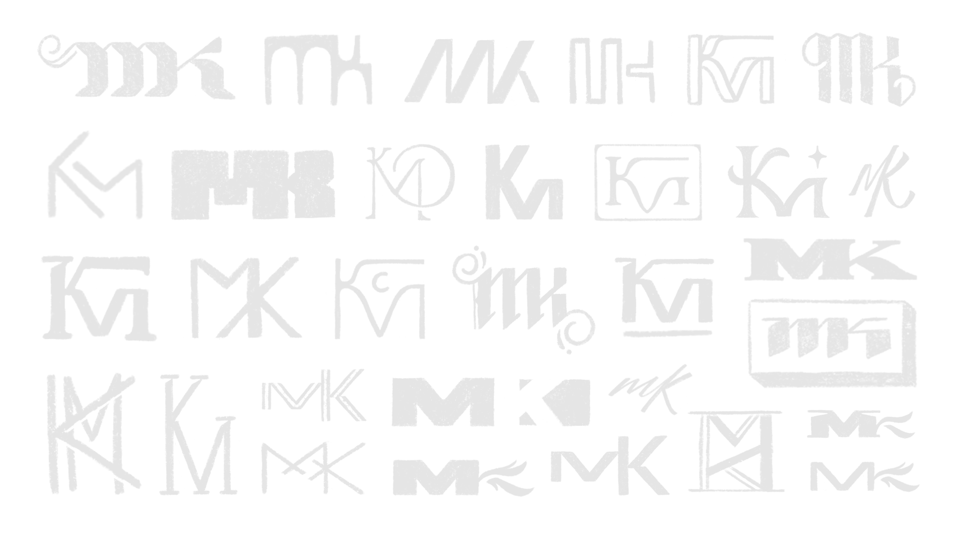
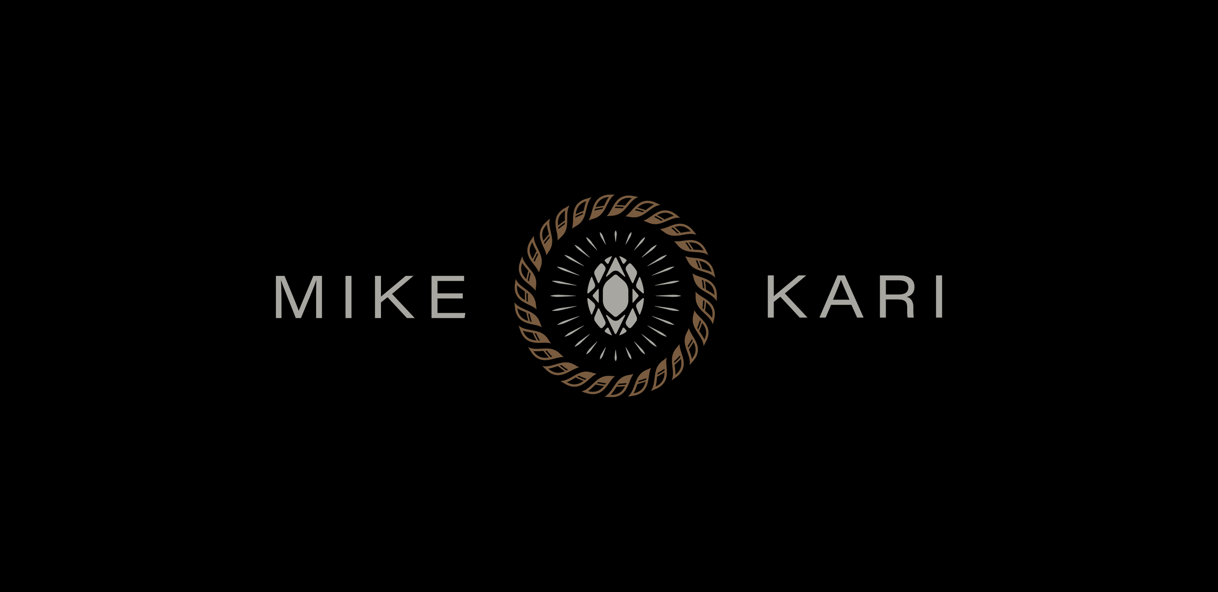
The first task was designing the logo. My approach was to choose a minimal Sans Serif font and pair it with an icon that was a representation of our wedding rings. I also designed a monogram to later be used on future collateral we will create as a married couple.

Invitation Set
Our invitation set included a small card with a special note showing our appreciation for our guests, a details card that acted as a resource for all event related information. The third and final piece of the set was of course the invitation itself.
Preparation
Leading up to the big day, we thought it might be beneficial to put together a shot list and basic snapshot of inspiration to help give direction to our photographer as to what we were hoping to have captured during the event. This also meant that I could explore a branded presentation deck– utilizing the fonts, colors, and graphic elements I had already established to create an organized and stylized presentation.

Food & Beverage Signs
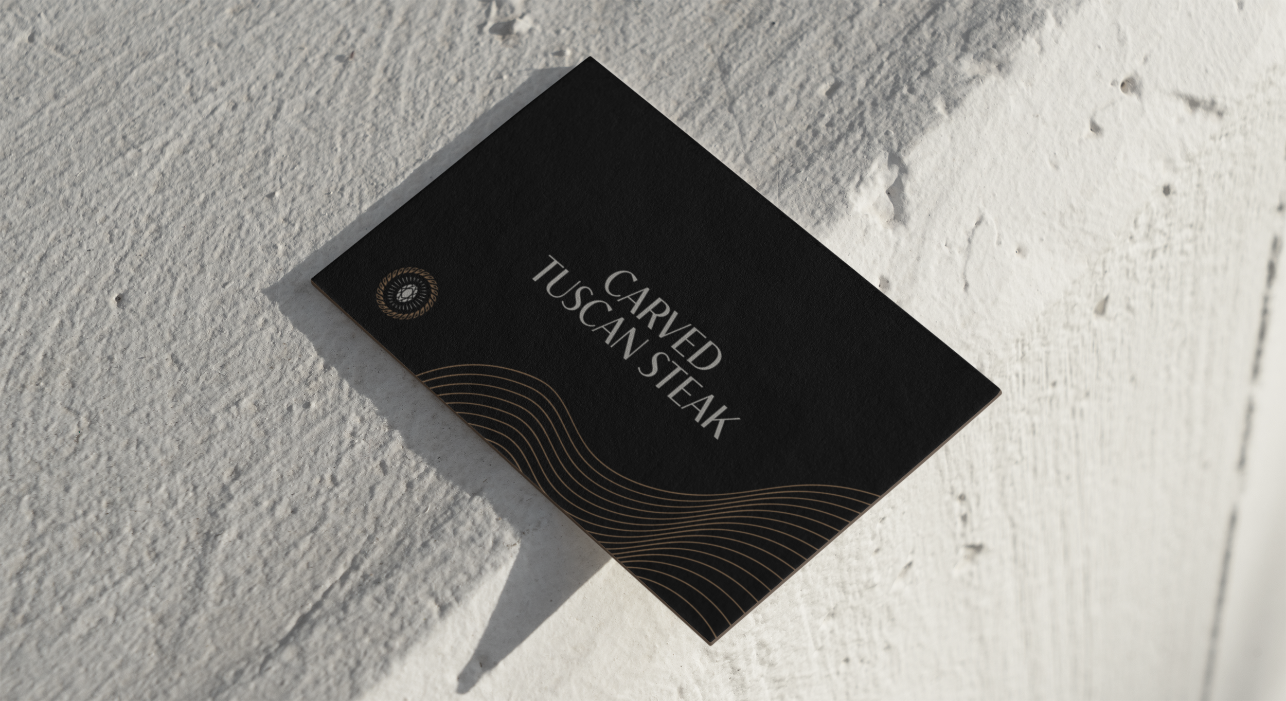
Like many other weddings, we had our own signature cocktails for our guests to enjoy, along with a carefully crafted catered dinner. This was a perfect opportunity to infuse some illustration and branded moments into the collection of pieces I would create for the event. These signs were placed on the bars, tables, and serving trays for guests to see and know that they were available to order.


